
티스토리 뷰
df1 = pd.read_csv('./data/sales1.csv', encoding = 'cp949')
df2 = pd.read_csv('./data/sales2.csv', encoding = 'cp949')
df3 = pd.read_csv('./data/sales3.csv', encoding = 'cp949')

#처음엔 data를 확인해야한다, unique 부터 확인해서 이상한 data가 있는지 확인
# info 함수로 data 형태를 보기는 편하지마 나오는게 적다
df1['ORDERID'].unique()
df2['PRODUCT_TYPE'].unique()

df1['ORDERID'].nunique() #unique의 개수
df1['GENDER'].value_counts() #value의 개수
df3.isnull().sum() #isnull 에서 T, F로 나온걸 Sum 하면 T가 1이기 때문에 개수가 됨
> Rating 열에 빈간이 4개 있어서 확인해 보면
df3[df3['RATING'].isnull() == True]
df3 = df3.fillna(0)
df3.isnull().sum()
> df3.fillna(0) 0으로 채워 넣기
df3['PAYMENT'].unique()
> Samsungpay 공백 지우기
df3['PAYMENT'] = df3['PAYMENT'].str.strip()
df3['PAYMENT'].unique()
df2_left = pd.merge(df1, df2, on= "ORDERID", how= 'left')
df3_left = pd.merge(df2_left, df3, on = 'ORDERID', how='left')

df3_left.to_csv('./data/sales.csv', index = False)
> csv 저장할 때 index = False라고 해야지 Index가 하나의 열로 저장이 안 됨
df001 = pd.DataFrame([['철원', 3],
                     ['혁진', 7]],
                     columns = ["name",'numbers'])

df002 = pd.DataFrame([['예인',9],
                      ['솔이',8]],
                      columns = ['name','numbers'])

df003 = pd.concat([df001,df002])
df003
df004 = df003.reset_index()
df004
df005 = pd.concat([df001, df002],ignore_index = True)
df005
> 열로 붙일 때 Index가 겹치는 경우를 방지해야 한다.
> 붙이고 Index 초기화하거나 Index 무시하고 붙이는 방법으로 하면 된다.
#iloc 과 loc
df.iloc[3,4]
df.iloc[4:8, 1:5] #행과 열의 범위 단, 마지막은 안 들어감
df.iloc[5:,:4] # 5행에서 끝까지, 0열 부터 3열까지
df.iloc[:,-1] #마지막 열, 머신 러닝에서 Target 불러올 때 많이 씀
df.iloc[:,-4:-1] #마지막 열부터 4번째 부터 마지막 열부터 2번째 열까지


df.loc[:,'CRIM']
df.loc[df['ZN']>5, 'CRIM'] #ZN > 50인 데이터의 CRIM 열
> 자연어 처리는 Deep Learning으로 해야 함 (신경망 CNN RNN)
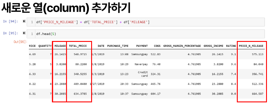

df['PRICE_N_MILEAGE'] = df['TOTAL_PRICE'] + df['MILEAGE']
df.drop('PRICE_N_MILEAGE', axis =1, inplace = True) # axis =1 열 방향, inplace 기존 데이터 대체 여부
> 새로운 열에 조건에 맞는 값 입력하기
df.describe() #df의 기초 통계량
df['GRADE'] ="" #Grade 열 추가 (값은 없음)
n = len(df) #행 개수

for i in range(n):
    total_price = df['TOTAL_PRICE'][i]

    if total_price < 200:
        df.loc[i, 'GRADE'] = 'NORMAL'
    elif 200 <= total_price < 500:
        df.loc[i, 'GRADE'] = 'VIP'
    else :
        df.loc[i, 'GRADE'] = 'VVIP'
> 날짜 다루기
import datetime

now = datetime.datetime.now()
print(now)

nowDatetimeS = now.strftime('%Y-%m-%d %H:%M:%S.%f')
print(nowDatetimeS)

nowDatetime = now.strftime('%Y-%m-%d %H:%M:%S')
print(nowDatetime)

nowDate = now.strftime('%Y-%m-%d')
print(nowDate)

nowHM = now.strftime('%H:%m')
print(nowHM)

nowHM2 = now.strftime('%H%m')
print(nowHM2)

dt = now - datetime.timedelta(minutes = 20)
print(dt)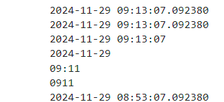

> 표준 형식은 날짜 사이 / 가 아닌 - 이다.
> 날짜 형식을 바꾸는 함수는 to_datetime이고 format은 바꿀 형식이 아닌 지금 형식을 써야 한다.
> strftime은 시간을 문자열로 변환, strptime은 문자열을 시간으로 변환
df['DATE'] = pd.to_datetime(df['DATE'], format = "%m/%d/%Y")
df['DATE']
from datetime import datetime

xmas = datetime.strptime('2024-12-25', '%Y-%m-%d').date()
print(xmas)

df['To_XMAS'] = (xmas -df['DATE'].dt.date).astype(str).str[:5].astype(int)
df.head(5)

> False는 내림차순
> groupby(X)(Y). mean() 은 X 열 기준으로 Y 값의 평균
> groupby()에서 as_index 설정 안 하면 Series로 나옴 기준으로 설정한 열은 Index로 나온다.
> 범주를 나누는 건 문자이고 숫자 열로 계산
df.groupby('GENDER')['TOTAL_PRICE'].mean()
df.groupby('GENDER', as_index = False)['TOTAL_PRICE'].median()

> Crosstab는 범주형 data의 열끼리 개수, 문자 열 끼리 조합임
> normalize index는 가로(행) 기준으로 비율, column은 세로, 열 기준으로 비율
> margins 옵션은 합계까지 나
table1 = pd.crosstab(df['GENDER'], df['CITY'])
print(table1, "\n")

table2 = pd.crosstab(df['GENDER'], df['CITY'], normalize = 'index')
print(table2, "\n")

table3 = pd.crosstab(df['GENDER'], df['CITY'], normalize = 'columns')
print(table3, '\n')

table4 = pd.crosstab(df['GENDER'], df['CITY'], margins = True)
print(table4)
pivot1 = df.pivot_table(index ='GENDER', columns ='CITY', values ='TOTAL_PRICE', aggfunc='sum')
print(pivot1,'\n')

pivot2 = df.pivot_table(index = "GENDER", columns ="CITY", values = 'TOTAL_PRICE', aggfunc='mean')
print(pivot2, '\n')

pivot3 = df.pivot_table(index = "GENDER", columns = "CITY", values = 'TOTAL_PRICE', aggfunc = 'median')
print(pivot3)

> 과일에 대한 숫자를 1,2,3이라고 하면 3-2 포도 - 배는 사과라는 산술적인 관계가 생기지 않는다
> 이를 고려해 숫자로 변환한 것이 one hot encoding이라고 한다.
> 세 개가 feature인 이유는 과일이 세 개이기 때문.
> 좋은 방법이지만 feature가 너무 많이 늘어나기 때문.
> Deep learning에서 쓰지만 꼭 알고 있어야 한다.
#one hot encoding : 문자열을 숫자로 feature 화

df = pd.DataFrame([
    [42, 'male', 12, 'reading', 1],
    [35, 'female', 3, 'cooking', 0]
])

df.columns = ['age','gender', 'month_birth', 'hobby', 'target']

df_oh = pd.get_dummies(df, dtype = float)
print(df_oh)

#특정 열만 가능
df_oh1 = pd.get_dummies(df['hobby'], dtype = float)
print(df_oh1)

# 특정 열로 one hot encoding 가능
데이터 시각화
> 히스토그램은 x축 기준으로의 개수
> bins는 막대기의 개수, 구간의 개수
> alpha는 색깔 투명도,
import matplotlib.pyplot as plt
plt.hist(df['TOTAL_PRICE'], bins=20, color = 'green')
plt.show
plt.hist(man_price, bins =20, color = 'green', alpha = 0.4, edgecolor = 'black', linewidth = 1, label = 'man')
plt.hist(woman_price, bins =20, color = 'red', edgecolor = 'black', alpha = 0.5, linewidth =1, label = 'woman')
plt.xlabel('Total_Price')
plt.ylabel('Counts')
plt.legend()
plt.show
> barplot 쌓을 때 bottom 옵션으로 어떤 게 밑에 있을 건지 설정해줘야 함
> x 축 lable을 기울이는 plt.xticks(rotation = 45)
bar_chart = df['CITY'].value_counts()
print(bar_chart)

bar_chart_idx = bar_chart.index
print(bar_chart_idx)

colors = ['red','blue','yellow']

plt.bar(x=bar_chart_idx, height = bar_chart, color=colors)
plt.show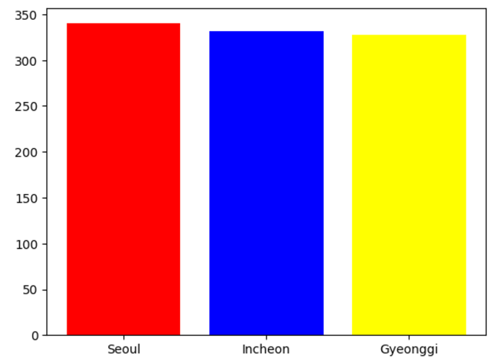
city_gender = pd.crosstab(df['CITY'], df['GENDER'])
print(city_gender.index)

plt.bar(x=city_gender.index, height = city_gender['Male'], color = 'paleturquoise', label = 'Male')
plt.bar(x=city_gender.index, height = city_gender['Female'], color = 'lightcoral', bottom = city_gender['Male'], label='Female')
plt.ylim(0,500) #y축 범위
plt.xticks(rotation = 45) #x축 라벨 돌리기
plt.legend()
plt.show()
city_gender = pd.crosstab(df['CITY'], df['GENDER'])

fig, ax = plt.subplots()
bar1 = ax.bar(x=city_gender.index, height = city_gender['Male'], color = 'paleturquoise', label = 'Male')
bar2 = ax.bar(x=city_gender.index, height = city_gender['Female'], color = 'lightcoral', bottom = city_gender['Male'], label='Female')

ax.bar_label(bar1,label_type = 'center')
ax.bar_label(bar2, label_type = 'center')
ax.legend()

ax2 = ax.twinx()
ax2.set_ylim(250, 400) #보조 축
ax2.plot(city_gender.index, bar_chart, '^-', label='price')

plt.ylim(0,500) #y축 범위 bar_chart
plt.xticks(rotation = 45) #x축 라벨 돌리기

plt.show()
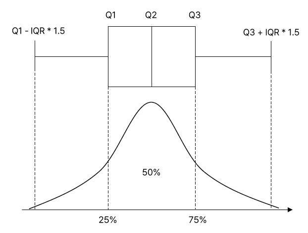

> box plot이 갖는 의미는 범위와 중심 치를 나타낸다.
plt.boxplot(df['TOTAL_PRICE'])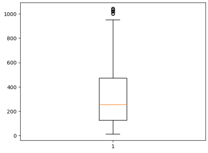
man = df[df['GENDER'] == 'Male']
woman = df[df['GENDER'] == 'Female']

plt.scatter(man['UNIT_PRICE'], man['TOTAL_PRICE'], color = 'blue', label = 'man')
plt.scatter(woman['UNIT_PRICE'], woman['TOTAL_PRICE'], color = 'red', label ='woman')
plt.legend(title = 'GENDER')
plt.xlabel('unit price')
plt.ylabel('total_price')
plt.show()

city_list = list(category_counts.index)
expl = [] # 부채꼴과 중심까지의 거리
for city in city_list:
    if city == 'Seoul':
        expl.append(0.1)
    elif city == 'Gyeonggi':
        expl.append(0.5)
    else:
        expl.append(0.05)

plt.pie(category_counts, labels = city_idx, autopct = "%.2f%%", startangle = 90, counterclock = False, explode = expl)
> matplotlib은 커스텀하기 좋지만 코드가 많아서 seaborn은 좀 더 코드 양이 작은 library
import seaborn as sns
sns.histplot(data = df, x='TOTAL_PRICE', color = 'skyblue', bins = 20, kde =True)
#kde 곡선 형태의 추세선 추가
sns.histplot(data=df, x='TOTAL_PRICE', hue= 'GENDER') #쌓아서

color = ['red', 'blue', 'yellow']
palette1 = sns.color_palette(color)
sns.countplot(data=df, x='CITY', palette =palette1, hue = 'GENDER')
sns.boxplot(data = df,y='TOTAL_PRICE', x='GENDER')
sns.scatterplot(data =df, x='UNIT_PRICE',
                y='TOTAL_PRICE',
                hue='GENDER',
                size='CITY',
                palette={'Male': 'blue', 'Female': 'red'})
import plotly.express as px
fig = px.histogram(data_frame =df, x ='TOTAL_PRICE', color = 'GENDER', title ='Total Price Gender')
fig.update_layout(barmode='overlay', width =600, height =400)
fig.show()

> barmode 가 overlay면 겹치기
> plotly 라이브러리는 반응형이고 Zoom이랑 데이터 선택해서 보기 가능
> 대신 무거워서 잘 안 나오는 경우가 있음
> jupyter notebook에 그림 많이 그리면 뻗어버려서 주의 필요
fig = px.box(data_frame = df, x= 'GENDER', y="TOTAL_PRICE", color = 'GENDER')
fig.show()

fig = px.scatter(data_frame = df, x ='UNIT_PRICE', y='TOTAL_PRICE', color ='CITY', symbol = 'GENDER')
fig.show()
import plotly.express as px
category_counts = df['CITY'].value_counts().reset_index()
category_counts.columns = ['city', 'freq']

fig = px.pie(data_frame = category_counts, names ='city', values ='freq')
fig.update_traces(hole = .3, pull = [0.1,0.5,0])
fig.update_layout(width =600, height =700)
fig.show()
'Machine Learning 입문' 카테고리의 다른 글
| 7. 최적화 & 모형 평가 (1) | 2024.12.26 |
|---|---|
| 6. 확률 분포 & 가설 검정 (0) | 2024.12.26 |
| 4. 기초 통계 & 시각화 (2) | 2024.12.26 |
| 3. 선형 대수 (0) | 2024.12.24 |
| 2. 기초 수학 (0) | 2024.12.24 |
- Total
- Today
- Yesterday
- Fiber Optic
- Reverse Bias
- 광 흡수
- Donor
- Charge Accumulation
- 양자 웰
- channeling
- Acceptor
- CD
- PN Junction
- MOS
- Diode
- Blu-ray
- Optic Fiber
- Laser
- 열전자 방출
- 문턱 전압
- 반도체
- Solar cell
- pn 접합
- fermi level
- Thermal Noise
- Pinch Off
- 쇼트키
- EBD
- semiconductor
- Semicondcutor
- Depletion Layer
- Energy band diagram
- C언어 #C Programming
| 일 | 월 | 화 | 수 | 목 | 금 | 토 |
|---|---|---|---|---|---|---|
| 1 | 2 | 3 | 4 | 5 | ||
| 6 | 7 | 8 | 9 | 10 | 11 | 12 |
| 13 | 14 | 15 | 16 | 17 | 18 | 19 |
| 20 | 21 | 22 | 23 | 24 | 25 | 26 |
| 27 | 28 | 29 | 30 |